Wednesday, July 17, 2013

Week 6 : Magazine Cover

I chose to create a fictional luxury magazine about paradisiac travel destinations called "EDEN". I needed an illustration. I chose a picture I took few years ago in Bora Bora.


I shot this image with a 11mm at F16 to get that infinite depth of field effect. Few things had to be fixed on this image. the horizon is not straight, some areas in the flower bush are under exposed and the overall tone is too cold. Then the image can be enhanced with a little bit of additional contrast and sharpness. I used the auto HDR technique described in a previous post creating 7 jpeg images from the raw file exposed from -2 stops to +4 stops. I used them to created a tone-mapped composite with the HDR tools. Then I cropped and rotated the result, worked on the color, contrast and sharpness. I then selected only the flowers to apply some desaturation as I wanted the flowers to be very white. I also used the spot healing tool to remove the few objects floating in the sea. That intermediate result is here.


I then created the logo of the title with text and the symbol for water. My idea was that all text would be white. I then added the month, and the title and story line for each article. With the text just white the lisibility was poor so I added a drop shadow effect on the text layers to have more contrast between the text and the background image. to have a more dynamic composition I changed the font size of the first character of each title and put the beginning of each title on a diagonal from top right to bottom left. I had then to add a barcode. I found an image on the web but that image did not have a price on it . I recreated the price with characters already in the barcode so that the font is the same I created the $ sign using the S and adding a line and I created the U by copying the 0, cutting the top and adding 2 bars. here is the finished barcode. As an afterthought I am not sure $5.95 is expensive enough for the readers targeted by such a luxury magazine...


As a final touch I selected the tip of the roof and pasted it on top of the title. here is the final result


After comments from Jeff I made small corrections: the month title is now smaller. I felt that smaller it was not right to keep it on its own on the left, so I moved it on the right side of the magazine title and removed the shadow effect to make it even more discreet. I also adjusted the kerning of the article titles. especially as the first character is using a bigger font the distance to the next one was too big. here is the corrected version.


Tuesday, July 16, 2013

Week 5 GIF animation : the Juggler

The assignment is "just" to create a GIF animation. I have never done that before so I had no idea of the amount of work for a given result.  I decided to do a guy juggling with 3 balls. That was clearly something too complicated for a simple assignment! First I had to find a character. I found a picture on the web.


I cut the right and the left arm and through scale and mirror I created 5 positions for both the right and the left arms. Finding a ball was no challenge, so I had my basic elements: the torso, the arms in different positions and the ball. Looking at what the movements should be, it became obvious that I had to animate independently the arms and the balls so I created 5 video layers for the arms and the 3 balls. The torso remains still. Then as I wanted to have something credible I created an Excel spreadsheet to compute the real position and speed for the 3 balls for each frame, then I created the 3 balls video layers in the time line ( painful and long process but the smooth and realistic result is there ) . Then I had to add the movements of the arms and synchronize all the parts to have a smooth animation ( also complicated because no tool is helping and there are 5 independent movements to synchronize...). I then trimmed the whole animation so that the end is also 1 frame before the beginning to allow for a forever animation. I added a gradient on the background. I wanted to add the text "circus" on the top of the image. So as I had not spent enough time on this one already, I decided to create a color neon type of effect. I added a new video layer on which I just put the text a number of time just changing the color by changing the value of hue with a regular interval. I added a drop shadow and an inner glow to the text layers to achieve the neon effect. I finished by adding a simple illustration to suggest the inside of a circus. bottom line for this barely over 2s animation: 434 layers! here it is


Sunday, July 14, 2013

Week 5 HDR and AutoHDR

I have been using HDR for some time now. Like everybody I have used it as an "effect" but now it is part of my workflow for almost every images. Here is the story. I first tried HDR on extreme lighting situations. in this example I was taking a picture of the Beiging Opera "the egg". It is a structure in the middle of a small lake so with the reflection it is like ann egg in levitation. I wanted to capture that at night and to freeze the water my speed was around 30s. I used the bracketing function on my camera and I shot 6 pictures. here are the 2 extreme pictures in the stack


I use either photoshop or Photomatix to merge the pictures. This is the result for this stack


With the water perfectly still and the little glow on the top it looks like a space ship floating in the air.


My previous post was on Panoramas. Around the same Opera I shot the following image


This image is at the same time HDR and a panorama it is the result of 35 pictures ( 5 images with 7 exposures each ). As one RAW image is 25 MB the stack here is 875MB!!


I then explored the use of HDR as an effect to have images like this one ( picture taken by a friend during her travel in India)


It works but so many have been doing it that I have been bored with it pretty fast! and one day as I was shoting a cactus near Santa Fe, I saw that even with the bracketing done automatically, I could not have exactly the same image because the clouds were moving too fast. As I tried to do the HDR nevertheless I saw lots of "ghost" effects on the resulting image


On the other hand I discovered that when you shoot in RAW you capture more than what you see on a JPEG conversion and that the RAW converter in Photoshop was clipping the histogram. So I decided to generate jpeg images of a single RAW file by changing the exposure ( from -3 stops to + 3 stops with a 1 stop increment ) and I use that as a stack for the HDR process. That approach adds a lot of dynamics to the images by remapping the zones either over or under exposed. After some practice it can be done with a natural result. here is an example. 


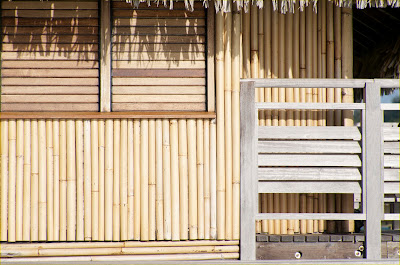
It is the bamboo wall of an hotel room in Bora-Bora. the wood is over exposed in some places and the zone under the roof on the top right is completely dark. I generated those exposures


I then used the the HDR tool and got the resulting tone mapped image


I rebalanced the image to have the following final result


As I shoot always in RAW I very often use this approach that gives more flexibility than the "recover" approach for example


Week 5 Panorama

before the digital image era I owned a panorama camera : an Hasselblad XPAN that was shooting wide pictures on a standard 135 film. Images like that:


So when I got my first digital camera before the DSLRs I wanted to do panoramas. For example I did this one from 5 images I took in the Swiss Alps with one of the early NIKON digital cameras (around 1990)


The reason it is special for me is that I did it completely manually! there was no panorama tools widely available so I spent a week of my free time to distort, scale rotate and match the colors!

Fast forward to 2013. I am now using either Photoshop or Panotools to stitch images. I shoot the images with the camera on a tripod with a rotating head and a rail to put the optical center above the center of rotation to avoid parallax problems in the overlapped areas. 

Few months ago I spent a week end in Las Vegas and took a day trip to the Grand Canyon. it was raining and snowing and freezing but there was 15 minutes with sun and I could shoot a serie of 7 pictures. I merged them with Photoshop and did the usual enhancement work on the resulting image. In particular I removed the shadow I projected on the left rock and I removed the metal safeguard on the right


Week 4 Movie Poster : The Queen of Night

For this assignment I imagined a movie based on part of the "Magic Flute" story and the opposition between the Queen of Night and the Sorcerer Sarustro. I found a nice portrait on the web from Kalipso studio photo


I cropped it and extended the left part with a black background, transformed it into a 1980x1080 picture and added some blue using duotone to have my base illustration


I then added the text. Two secondary titles are just white over the background. But for the main title I wanted something bolder I used a very thick font with a very big font size and I created the outline of the characters by rasterizing the text, then selecting the characters, contracting the section and using it as a mask to remove the core of the letters. I changed the size of the character, the horizontal and vertical pitch to almost cover 100% of the text area with characters. I positioned the texts to keep the eyes free to give more strength to the composition. Here is the final image.


Saturday, July 13, 2013

Week 4 : With Liquify buy one Model get two free

For this assignment using liquify, there was no additional guidelines, so I decided to work on a simple portrait found on the web.


I decided to try to use liquify and the usual retouch tools to transform the original model into another one. First I changed the race. beyond the obvious change on skin color I liquified the nose and the mouth. I then added some breast and made the model more athletic by creating higher and wider shoulders


Then I changed the gender. I liquified the nose and the mouth again, removed the breast and created a higher chest, larger arms, I extended the neck by moving the head and healing the result with the clone stamp. I liquified the sides of the face to create strong jaws that I emphasized with shadows on the cheeks and created a masculine chin. I then grew the eyebrows, reduced the eyes and added texture to the skin. I could not let the poor guy with the flowery tank top so I created a black T-shirt


Thursday, July 4, 2013

Week 4 Lab : Illustrating a Poem

here is the Poem:


Beginning
BY JAMES WRIGHT

The moon drops one or two feathers into the field.
The dark wheat listens.
Be still.
Now.
There they are, the moons young, trying
Their wings.
Between trees, a slender woman lifts up the lovely shadow
Of her face, and now she steps into the air, now she is gone
Wholly, into the air.
I stand alone by an elder tree, I do not dare breathe
Or move.
I listen.
The wheat leans back toward its own darkness,
And I lean toward mine.
I decided to focus on "Between trees, a slender woman lifts up the lovely shadow Of her face". I first took a forest image from Jeff and to use it as my set


the first thing was to correct the image, straighten it and give it a 16/9 aspect ratio. I used the perspective tool to straiten the trees and then the warp tool because the trees on the side of the image had become arched.


I wanted to integrate a moon in the picture so I created a hole using the eraser with a random dots brush to create a believable opening. I then integrated the moon. I chose a picture I had taken few years back


The only thing I did here is to desaturate a little bit that layer as I was beginning to work on the overall lighting of the scene. I wanted to integrate my woman character on the left of the picture. after trying different options I went for a close up dynamic portrait.


As expected selecting the face and the hair was a challenge. after multiple trials and errors I found an approach that worked well. using the quick selection tool I selected the face and the compact part of the hair. then I invert the selection and selected the rest of the hair with a color range on the red colors. I finished with manual repairs
the last element I wanted to integrate was the narrator. I imagine him half hiding behind a tree. I found this image and the selection was straight forward


I then integrated the elements in a picture and worked on the lighting. to recreate the monlight effect I first desaturated the yellow channel on all the elements, selected the highlight with color range on the forest and dramatically reduced the brightness, then I added a cool filter on the forest layer. I added shadows to the face to better match with the position of the moonlight and to create the idea that the face is the only part in the light thus "lifting up the shadow". Few additional corrections of the sharpness of the object were added so the scene is not too heterogeneous.

the last element added was the sentence chosen as the reference from the poem. here is the result


Wednesday, July 3, 2013

Week 3 Part 2 : Color Remapping

The assignment is to remap the colors of a picture using a matching palette. I chose a simple flower image to start from.


Then I chose a palette to use to correct the colors. I decided to use the assignment to mimic a picture that would look like the ones in the early color printed magazine. to achieve the effect I chose a Palette with 3 colors close to the 3 colors in the original image but far more saturated to mimic the limited dynamic early color films and printing process had. that palette has both the green of the leaves, the purple of the flowers and I chose to use the orange for the leaves that are brownish in the original picture. I would use the other green as a color for a fine border


For this image I mainly used the quick selection tool to select my 3 main zones to correct and added 2 pixels of expand and 2 pixels of feather so that the transitions are smooth. inside the selections I used the replace color tool to apply the color scheme. I then used the color half tone filter to simulate the magazine printing technique, and added a border with the fourth color as planned.


Tuesday, July 2, 2013

Week 3 Lab : Duotone

I tried first this technique with a picture I took in Napa during the fall:


I changed the mode first to gray tones and then to duotone with a green as the other ink


I do not like the result. I think to have a good result there is a need for more overall contrast and less local value changes. I looked back for another picture and found one from the eiffel tower taken with my Haselblad (on film! I miss the Blad lens quality...).


As the base image is already in gray tones I just had to transform it in duotone. I chose a red brownish color that looks like old rusty metal. I like this one far better.


Week 3 Part 1: Extreme Makeover : Sunset in Montana and Stable in Saratoga

This picture was shot by one of my friend in montana:


As the assignment states "all I want you to do is find one photo that needs correcting ", I think this image fits the description. So I asked for the RAW image and I corrected it. On an image that is so extreme what I begin to do is some kind of tone-mapping using a technique I call auto HDR. instead of doing HDR with multiple pictures with different exposure, I create multiple Jpeg copies of the same image after changing the exposure in the RAW editor. for this image I did not want the HDR to be an "effect" but just a rescue tool so I tried not to over do it. before doing the color and contrast correction I had to reduce the color noise in the picture to remove those random colored pixels. I then used a combination of curves, hue/saturation, on selected area some time on a separate layer with a mask to reach the interpretation I had in mind. I then made sure that the color system was consistent for example the color of the snow compared to the maximum light of the sky or the purple haze on the mountain as a complementary color of the sky color ( as the shadow is not black but the complementary of the light ). Finally few small touches like boosting the red boat or adding some sharpness. It was more work than expected, but the result shows that even when we think that a picture is lost there is still a lot of information left in the pixels. Here is the finished product.


I found another one (from the same photographer) but this time completely overexposed:


I did the same but pushed more the HDR on the "effect" side because I think it works well with the old wood and the spot light inside of the stable. I had to correct the perspective and crop a little on this one.


I spent more time on the color and the halo of the light inside as I wanted it to become a stronger part of the composition


Sunday, June 23, 2013

Week 2 Lab : Painting a Picture

the assignment was to "paint" a picture with brushes in photoshop. I used a picture I took in Tahoe with a long exposure (10s) to freeze the water. My goal was not to make a precise copy of the picture but to make a painting including the main elements of the composition with a soft focus texture.


I used the mix brush in a mode that is sampling the color from the actual picture on the background layer, and painted on a additional layer. I used a fairly large brush to mainly capture the main "blocks" in the composition. then I used an additional layer and painted with the normal brush to suggest the snow on the mountain and another layer to add a little bit of texture in the 2 main rocks.


Thursday, June 20, 2013

Week 2 Part 2 : Composite Bodies

The idea is to attach the head extracted from a picture to a body found in another picture. I searched the web for couples that could make a good final image and after some time I found 2 couples. I could not choose  one, so I did both!

the first couple is on one side a portrait of actress and super model Leaticia Casta made at the legendary Harcourt Studio and on the other side the headshot of a young Bob Dylan ( from the cover of the album " The times they are a changin'")


I thought the mix of Laeticia's pose and Dylan's attitude could be interesting. I used a combination of different selection tools to extract the head, mainly color range for the hair part and polygonal lasso for the chin. then a little bit of feather and copy paste. then resize and rotate to the final size and position. I used the clone tool to remove a little bit of the background head that was still visible. Then the difficult part began. To have something credible the "texture" and the lighting have to be consistent. I smothed bob's skin ( duplicate layer, gaussian blur , mask and a soft brush ) and then recreated the lighting effect on the face. that type of "1930's Holywood" lighting is very classy but is also very complex. I just used the lasso tool with a large amount of feather and the luminosity / contrast tool to recreate highlights and shadows. I then used the levels tool and a bit of sepia to try to better match the general tone of the studio shot. I then extracted a piece of Laeticia's shoulder and pasted it on top of Bob's chin. Voila!


the other couple I found was the iconic picture of a young Yves Saint Laurent ( the famous french fashion designer ) shot by Jean Loup Sieff ( one of my favorite photographer ) and a recent portrait of the Dude ( a k a  Jeff Bridges )


I basically used the same techniques for this one. As Jeff's picture is color I translated it to B&W using the hue/saturation tool pulling the saturation to 0 ( master chanel ) . Jeff's picture being significantly sharper I also softened it with gaussian blur. making the lighting match was a lot easier on this one.


OK this was fun. I wish I could pay the bills with a job like that ( but I don't have much hope...)